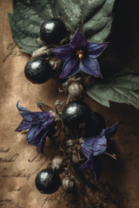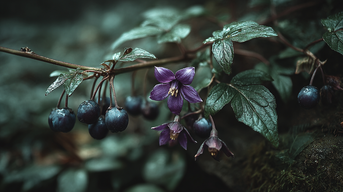
A poison garden does not announce itself. It looks, from a distance, like any other overgrown corner of an old estate: ferns pushing through cracked stone steps, ivy claiming the walls, trees closing over the path until the light turns green and uncertain.
The colors pulled from this image carry that same quality. Nothing here is loud. The danger is in the details.
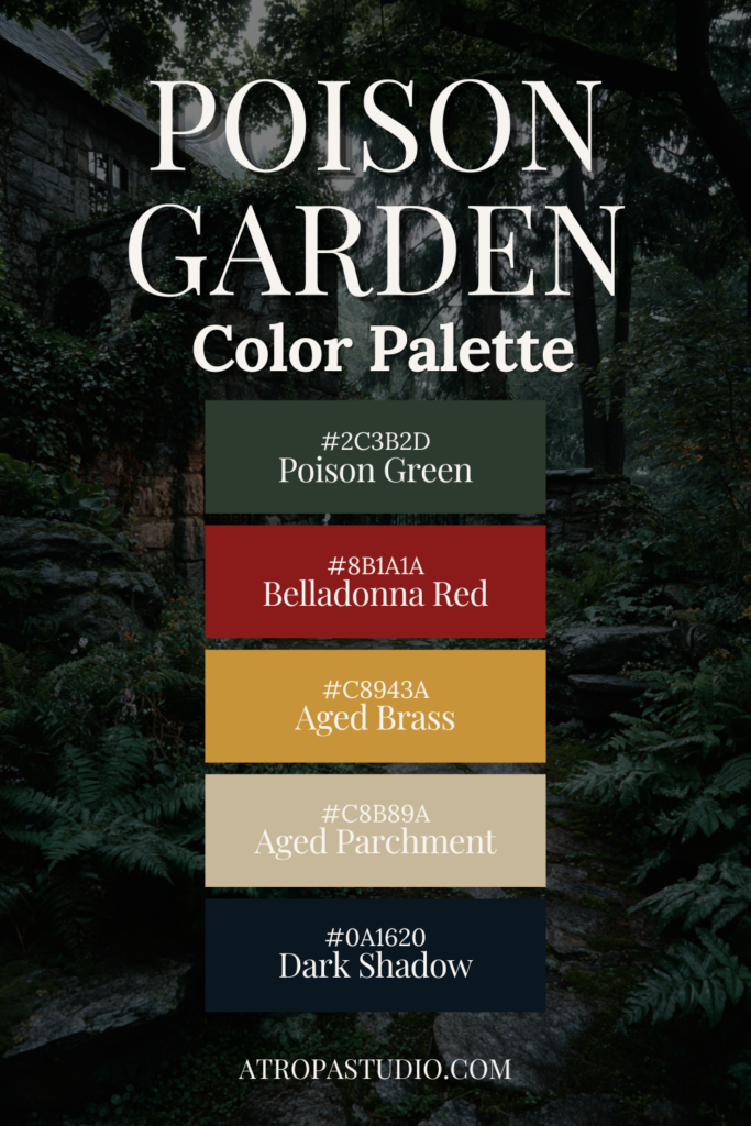
The Colors
Poison Green
- Hex: #2C3B2D
- RGB: 44, 59, 45
- CMYK: 25, 0, 24, 77
A very deep forest green that reads almost black in shadow. This is the color of dense foliage seen through mist, of moss on stone that never fully dries, of a garden that has been growing undisturbed for a long time.
In the home:
- Use on cabinetry, painted furniture, and feature walls in rooms with low or warm lighting
- Works particularly well in a study, library, or dining room where you want the walls to feel present rather than receding
- Pair with aged brass hardware and dark wood tones for maximum depth
In web design:
- A strong primary background for botanical and editorial dark sites
- Use for navigation bars, hero sections, and footer areas where atmosphere is the goal
- Pairs well with Aged Brass and Aged Parchment for a warm, readable hierarchy against dark surfaces
Belladonna Red
- Hex: #8B1A1A
- RGB: 139, 26, 26
- CMYK: 0, 81, 81, 45
A deep, dark crimson named for the berries of Atropa belladonna: glossy, dark red, and beautiful in exactly the way that should make you cautious. This is not a bright red. It is the color of dried blood, of old wax seals, of velvet that has faded in a room that does not get enough light.
In the home:
- Use on a single accent wall in a dining room or bedroom for maximum drama
- Works well on upholstered furniture: a dark velvet chair, a tufted headboard, a window seat cushion
- Pair with Poison Green and aged brass rather than any cool-toned metal
In web design:
- A strong accent for alerts, badges, and decorative elements that need to draw attention without brightness
- Works well as a hover state on dark cards and secondary buttons
- Use sparingly as a typographic accent for drop caps or section dividers on very dark backgrounds
Aged Brass
- Hex: #C8943A
- RGB: 200, 148, 58
- CMYK: 0, 26, 71, 22
A warm antique gold that sits closer to brass than to yellow. The color of old garden gates, of tarnished plant markers, of the hardware on a cabinet that has not been polished since it was installed. It is the warmest and most luminous tone in the palette.
In the home:
- Most effective as a material: unlacquered brass garden fixtures, aged bronze plant stakes, tarnished candleholders
- If used as paint, apply inside a niche, a cabinet interior, or a small recessed detail
- Works in textile form through mustard linen, raw silk, or aged gold embroidery thread
In web design:
- The natural choice for CTAs, links, and interactive elements on dark backgrounds
- Use as the primary accent color across buttons, underlines, and focus states
- Warm enough to feel considered rather than corporate; avoid overusing it at large scale
Aged Parchment
- Hex: #C8B89A
- RGB: 200, 184, 154
- CMYK: 0, 8, 23, 22
A warm mid-tone tan that reads like old paper, like the pages of a botanical field guide left in a damp outbuilding for a season. Not quite cream, not quite beige. It carries the quality of something that was once white and has since absorbed everything around it.
In the home:
- Use on walls in rooms where the other palette tones appear in furnishings and objects
- Works well on linen upholstery, aged cotton, and undyed woven textiles
- A natural companion to leather-bound books, dried botanicals, and unglazed stoneware
In web design:
- A strong choice for body text backgrounds and content card surfaces within a dark site
- Warm enough to feel intentional without competing with the darker tones
- Pairs cleanly with Dark Shadow for body text to create a high-legibility editorial feel
Dark Shadow
- Hex: #0A1620
- RGB: 10, 22, 32
- CMYK: 69, 31, 0, 87
A very deep navy that sits at the far end of darkness. This is not the primary green of the garden but the shadow that falls between the stones when the light fails. It carries the quality of deep water, of the sky at the edge of a storm.
In the home:
- Use on ceiling beams, window frames, and deep-set alcoves where you want shadow to feel intentional
- Works well as a painted interior for built-in cabinetry where Deep Shadow becomes the backdrop for displayed objects
- Pair with Aged Brass and Aged Parchment to keep it from reading as cold
In web design:
- An excellent deep background alternative to pure black for sites that need atmosphere over severity
- Use for navigation, footer sections, and any area where maximum depth is needed
- Pairs naturally with Aged Brass for interactive elements and Aged Parchment for readable body text
Using the Full Palette
This palette has more tension in it than most. The Belladonna Red and Poison Green sit in direct opposition to each other, and the warmth of Aged Brass is the only thing that mediates between them. Used well, that tension is exactly the point.
In a home interior:
- Anchor with Dark Shadow on the deepest surfaces: a ceiling, a recessed alcove, window frames
- Use Poison Green on cabinetry or a primary feature wall
Introduce Belladonna Red through a single upholstered piece or a painted accent - Let Aged Brass appear only in metal and candlelight
- Reserve Aged Parchment for the lightest surfaces: linen, paper, unglazed clay
In web design:
- Dark Shadow as the deepest background layer
- Poison Green for secondary surfaces, card backgrounds, and navigation
- Belladonna Red for alerts, badges, and decorative accents used sparingly
- Aged Brass as the primary interactive accent across buttons and links
- Aged Parchment for body text areas and content surfaces requiring legibility
The Ultimate Dark Cottagecore Colour Palette Collection
Explore a growing library of dark cottagecore colour palettes pulled from poison gardens, candlelit kitchens, foggy forests, and shadowed interiors. Hex codes, RGB values, and home decor ideas for every shade. New palettes added regularly.