The dark cottagecore aesthetic doesn’t have a single colour. It has a mood – and that mood can be achieved through half a dozen different combinations, each one pulling from the same shadowed world but landing somewhere distinct.
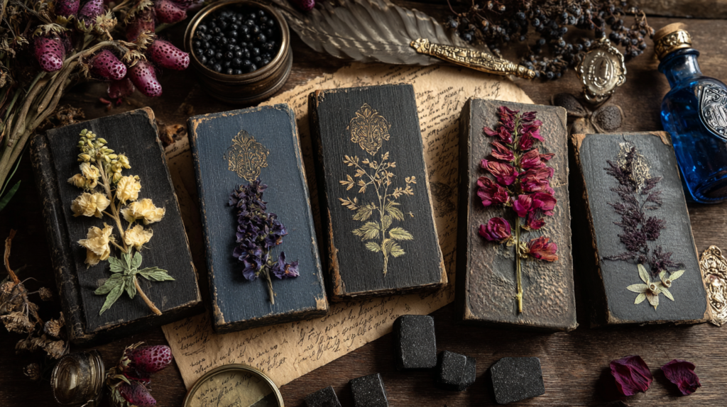
It is not a monochrome aesthetic, despite what the name suggests. Dark cottagecore borrows from the poison garden and the apothecary shelf, from the forest floor at dusk and the hearthside in October.
It finds beauty in the colours that other aesthetics overlook – the particular green of something growing in permanent shade, the amber of candlelight through dark glass, the near-black of a room that has decided it has nothing to prove.
The palettes below are not prescriptive. They are starting points – six distinct moods drawn from the same shadowed source, each one with its own atmosphere and its own logic.
The Poison Garden
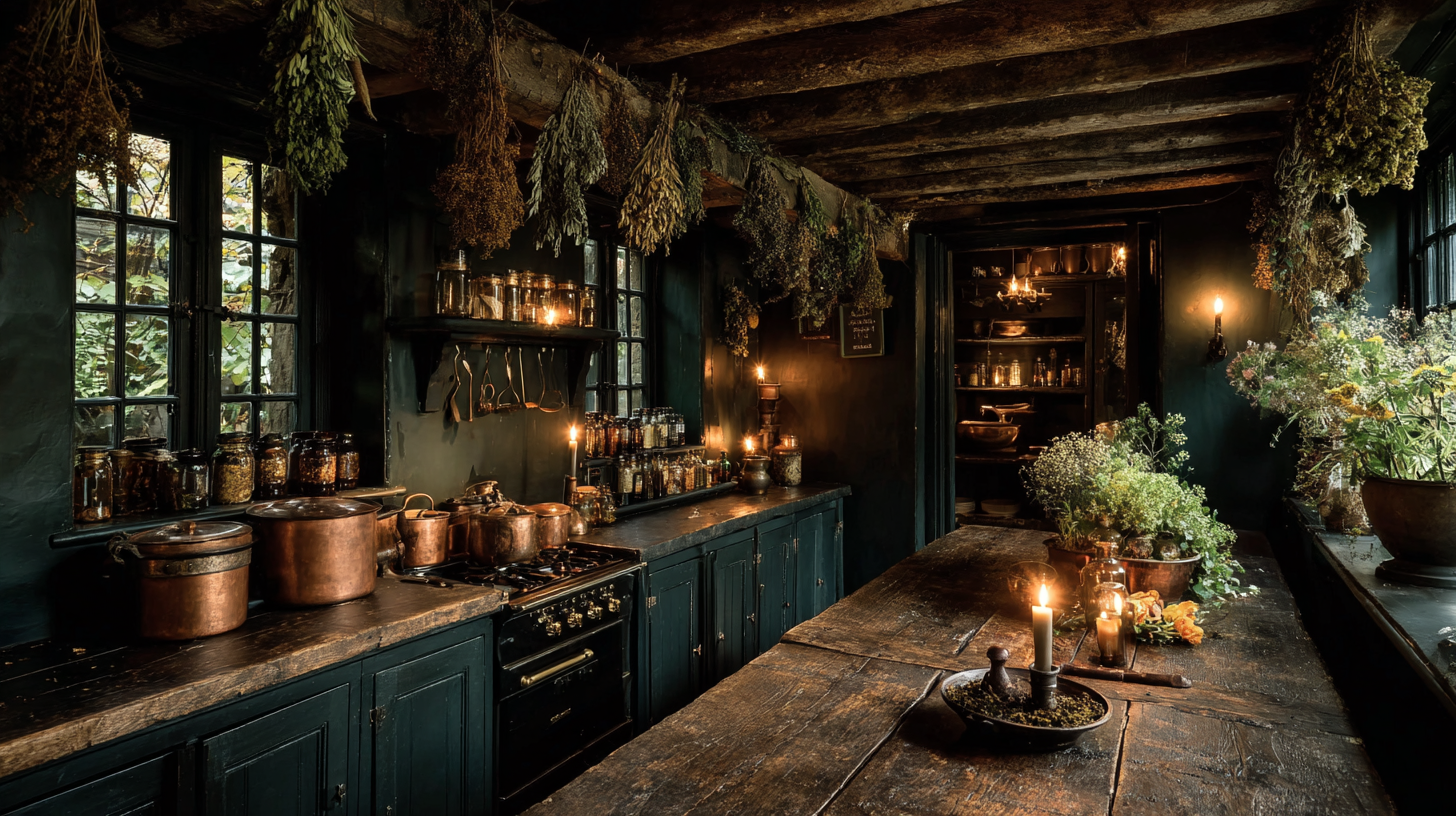
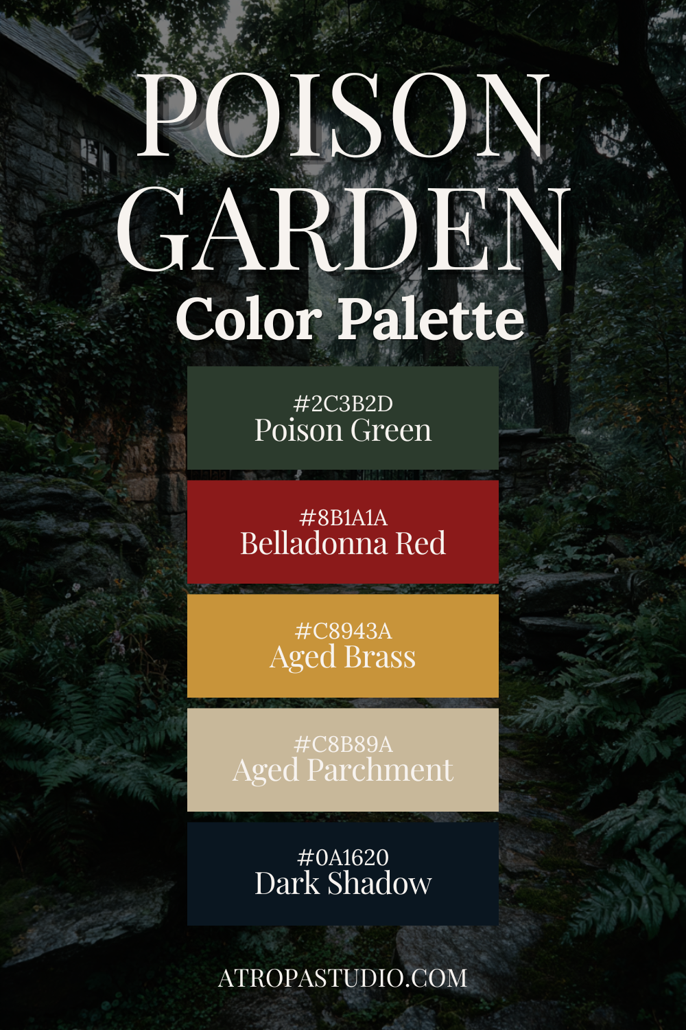
This is the foundational dark cottagecore palette – the one most people picture when they first encounter the aesthetic.
Poison green anchors everything, the colour of something that has been growing in permanent shade without apology.
Against it, belladonna red sits in direct contrast – dark and arterial, the exact colour of a deadly nightshade berry. It is not the red of a warm room or a holiday decoration. It is the red of something you should not touch, which makes it the most honest colour in the palette.
Aged brass catches the candlelight the way nothing else does – not gold, not chrome, but the particular warm tarnish of metal that has been handled for decades.
Aged parchment is the single light note, the element that keeps the palette from collapsing into itself.
Dark shadow sits at the base of everything, the deepest point, the colour of the garden at midnight when even the moonlight doesn’t reach.
In a room, this palette lives in matte-painted cabinetry and dark green walls, in copper pots on wrought iron hooks, in a single red-glazed ceramic bowl on a stone countertop.
It is the palette of the poison garden itself – ordered, intentional, and quietly dangerous.
Use it in: kitchens, entryways, garden rooms, any space that benefits from feeling like it belongs to the outdoors as much as the indoors.
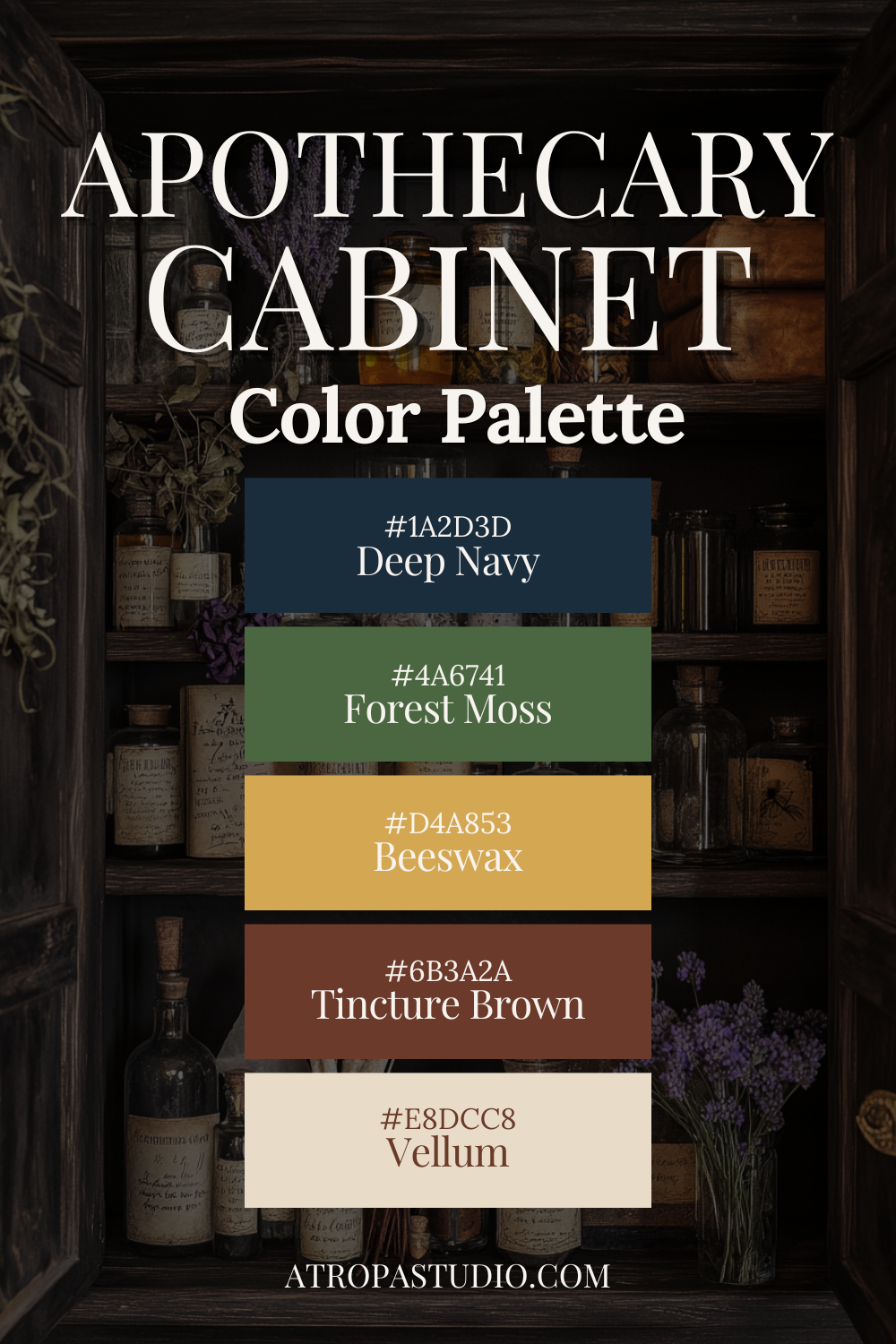
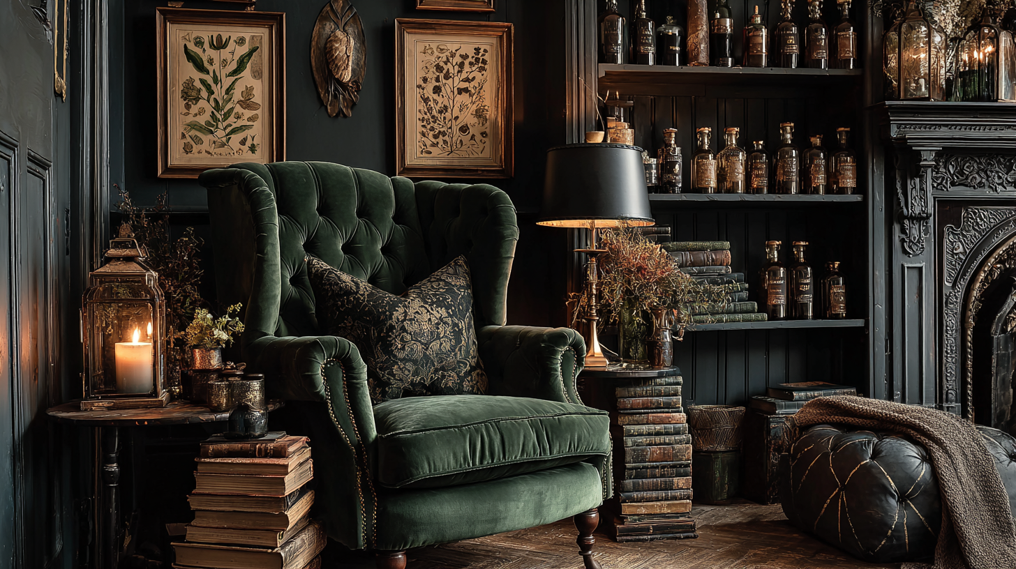
The Apothecary Cabinet
Cooler and more precise than the Poison Garden, the Apothecary Cabinet palette is built around two distinct dark anchors – deep navy and forest moss – that sit in cool contrast to each other.
Navy reads architectural and still. Moss reads botanical and alive. Together they create a palette that feels both ordered and organic, like a shelf that has been carefully arranged by someone who also lets things grow where they will.
Beeswax is the warm centre of the palette – not the bright gold of new brass but the particular yellow-amber of a candle that has been burning for hours, of old wax pooled around a wick, of the light in a room lit entirely by flame.
Tincture brown grounds everything in wood and earth – the shelf itself, the cabinet frame, the worn surface of a preparation table.
Vellum sits at the lightest point, the colour of old paper, of a botanical illustration page that has been handled many times.
This is the palette of someone who knows what each bottle contains and why it is where it is. It rewards organisation and careful arrangement.
In a room it asks for open shelving, for objects chosen with intention, for the kind of order that looks effortless because it is the product of long attention.
Use it in: studies, libraries, shelved alcoves, home offices, bathroom vanities styled as apothecary stations.
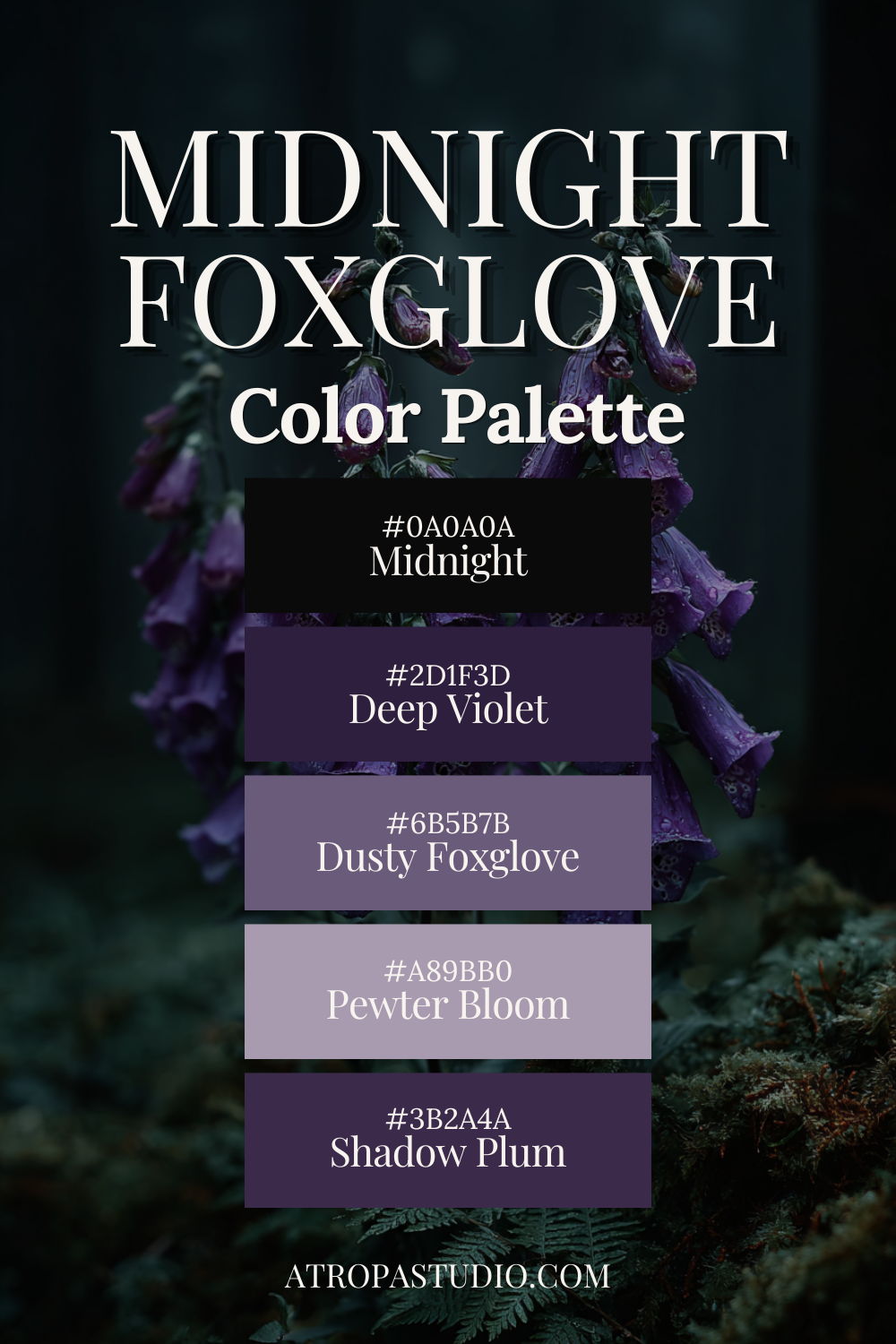
Midnight Foxglove
The most gothic of the six, and the one that requires the most commitment.
Midnight dominates – not charcoal, not dark grey, but the particular depth of near-black that absorbs light rather than reflecting it.
Into that darkness, the violet family enters across four distinct tones: deep violet at the darkest point, shadow plum as the mid-dark, dusty foxglove in the middle, and pewter bloom as the palette’s single concession to lightness – cool, muted, the colour of morning fog before the sun has fully risen.
The foxglove itself is the reference point. Digitalis purpurea – tall, spectacular, and toxic throughout. Its flowers are that particular dusty purple-pink that sits between violet and grey, beautiful and slightly wrong in the way that many poisonous things are slightly wrong.
This palette takes that quality and builds an entire room around it, moving from near-black through four gradations of violet-grey to the palest pewter at the top.
It is not a palette for every space or every person. It asks for confidence. A room built in Midnight Foxglove does not apologise for itself, does not soften its edges for visitors, does not explain. It simply exists in its own atmosphere and waits.
Use it in: bedrooms, reading rooms, any space that is primarily experienced in the evening or by artificial light.
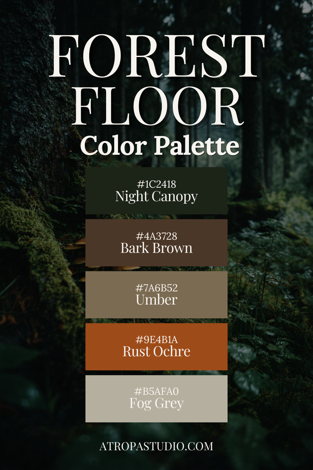
The Forest Floor
The earthiest palette of the six – least gothic, most wild.
Where Poison Garden is cultivated and Apothecary Cabinet is ordered, Forest Floor makes no such gestures toward civilisation.
This is the palette of the ground itself: deep moss green the colour of lichen on a north-facing stone, bark brown the exact shade of a fallen branch beginning its return to soil, umber the colour of the earth when it is wet and dark and alive with things you cannot see.
Fog grey enters as the light source of this palette – not amber candlelight but the cool diffused grey of an overcast woodland morning, the sky visible only in fragments through a dense canopy.
Night canopy sits at the base of everything, the darkest point, the forest floor at midnight when even the nocturnal animals have gone still.
In a room, this palette lives in natural materials: rough linen, unglazed ceramic, hand-hewn wood, stone that has not been polished smooth.
It does not want brass or copper. It wants iron – dark, matte, functional.
It wants textures that look like they came from outside because they did.
This is the palette most likely to attract those who came to dark cottagecore through goblincore or through a genuine relationship with the outdoors.
It is beautiful, and it is not trying to be.
Use it in: sunrooms, mudrooms, reading nooks, any space adjacent to an actual garden or natural view.
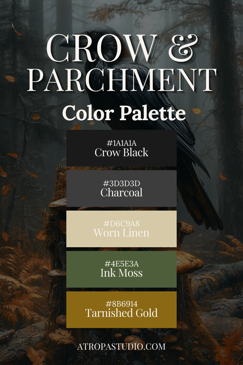
Crow & Parchment
The most restrained palette of the six – and in its restraint, possibly the most sophisticated.
Crow black and charcoal create a deeply neutral dark foundation, the absence of colour that makes everything placed against it stand out with precision.
Worn linen is the light note – softer and warmer than parchment, the colour of old fabric that has been washed many times and has arrived at its truest tone.
Ink moss and tarnished gold are the two colour decisions this palette makes, and they are both careful ones.
Ink moss is darker and more muted than forest green – it reads as almost grey in low light, becoming more clearly green only when it catches a warmer source.
Tarnished gold is not bright or decorative. It is the colour of the gilding on a Victorian herbarium plate, of a brass clasp on an old book, of metal that has decided patina is more interesting than polish.
In a room, Crow & Parchment is the palette for books.
For floor-to-ceiling shelves in dark-painted wood, for worn linen curtains against charcoal walls, for a reading chair positioned to catch the grey light from a north-facing window.
It is intellectual and atmospheric in equal measure.
Use it in: libraries, home offices, studies, bedrooms where reading is the primary activity.
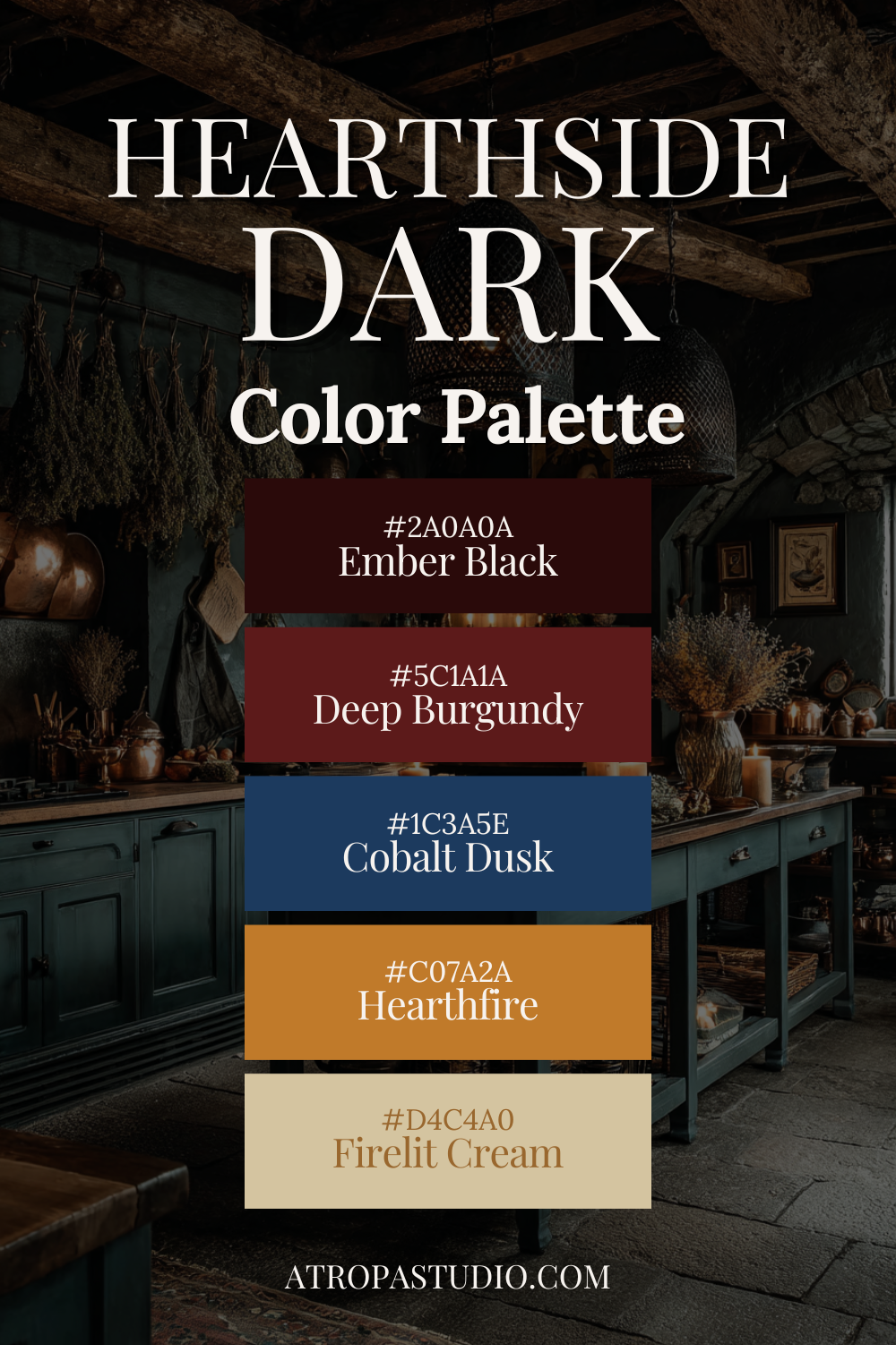
Hearthside Dark
The warmest palette of the six and the most unexpected in its construction – because it pairs burgundy with cobalt dusk, two colours that should not work together and absolutely do.
Ember black grounds everything at the darkest point, darker and warmer than true black.
Deep burgundy is the defining accent: the colour of dried blood, of old velvet, of a ceramic glaze that has been in a kiln that runs slightly hot.
Cobalt dusk is the surprise. Cool, deep blue sitting beside warm dark red creates the same tension as firelight against a cold window – each colour making the other more vivid by contrast.
It is the palette’s most contemporary decision and its most interesting one.
Hearthfire amber ties the warm tones together without brightening them, the colour of flame seen from a distance rather than up close.
Firelit cream sits at the lightest point – warmer than parchment, the colour of a room seen entirely by candlelight, where nothing is truly white.
This is the palette for the hour after the sun goes down.
It is designed for candlelight and firelight, for the specific quality of warmth that exists in a cold-climate home in October.
It is the dark cottagecore palette that feels most like shelter.
Use it in: living rooms, dining rooms, any space centered on gathering, warmth, or the ritual of an evening at home.
None of these palettes require a complete renovation. A single dark wall, a shelf of cobalt bottles, a copper pot catching the evening light.
The dark cottagecore aesthetic rewards restraint – the right object in the right corner does more than a room full of the wrong ones.
Choose the palette that feels like the version of yourself you’re building toward.
Then start there.