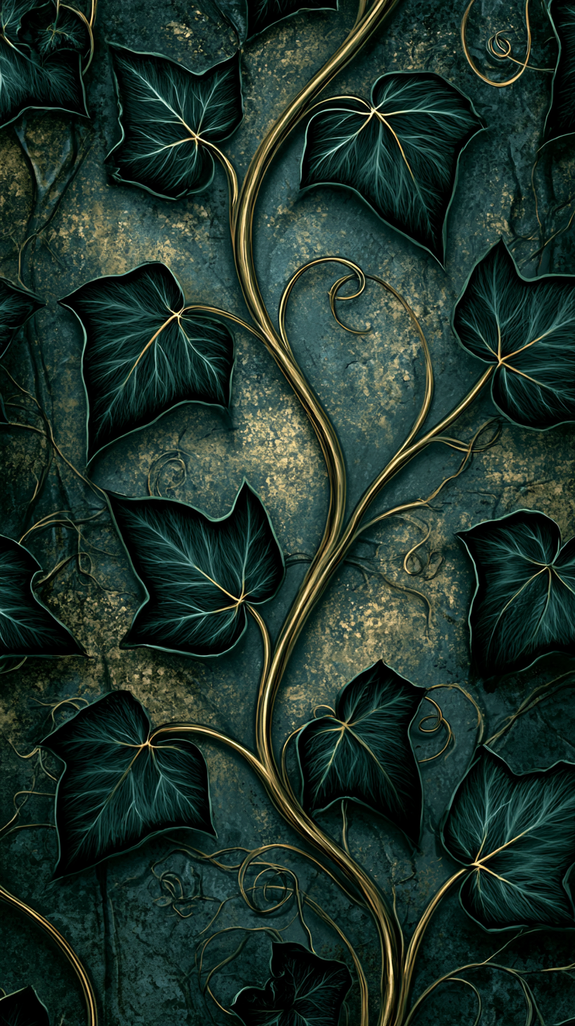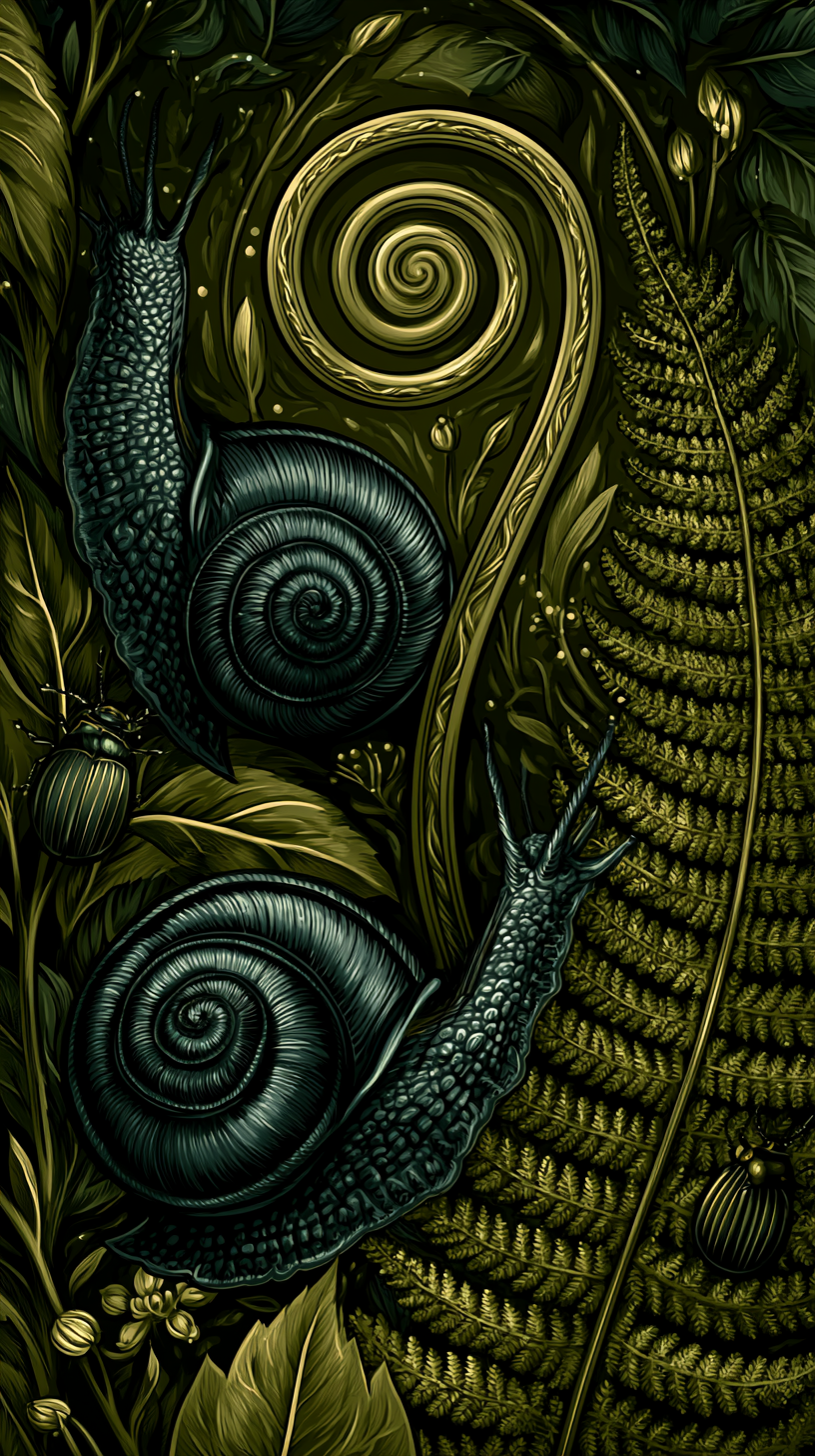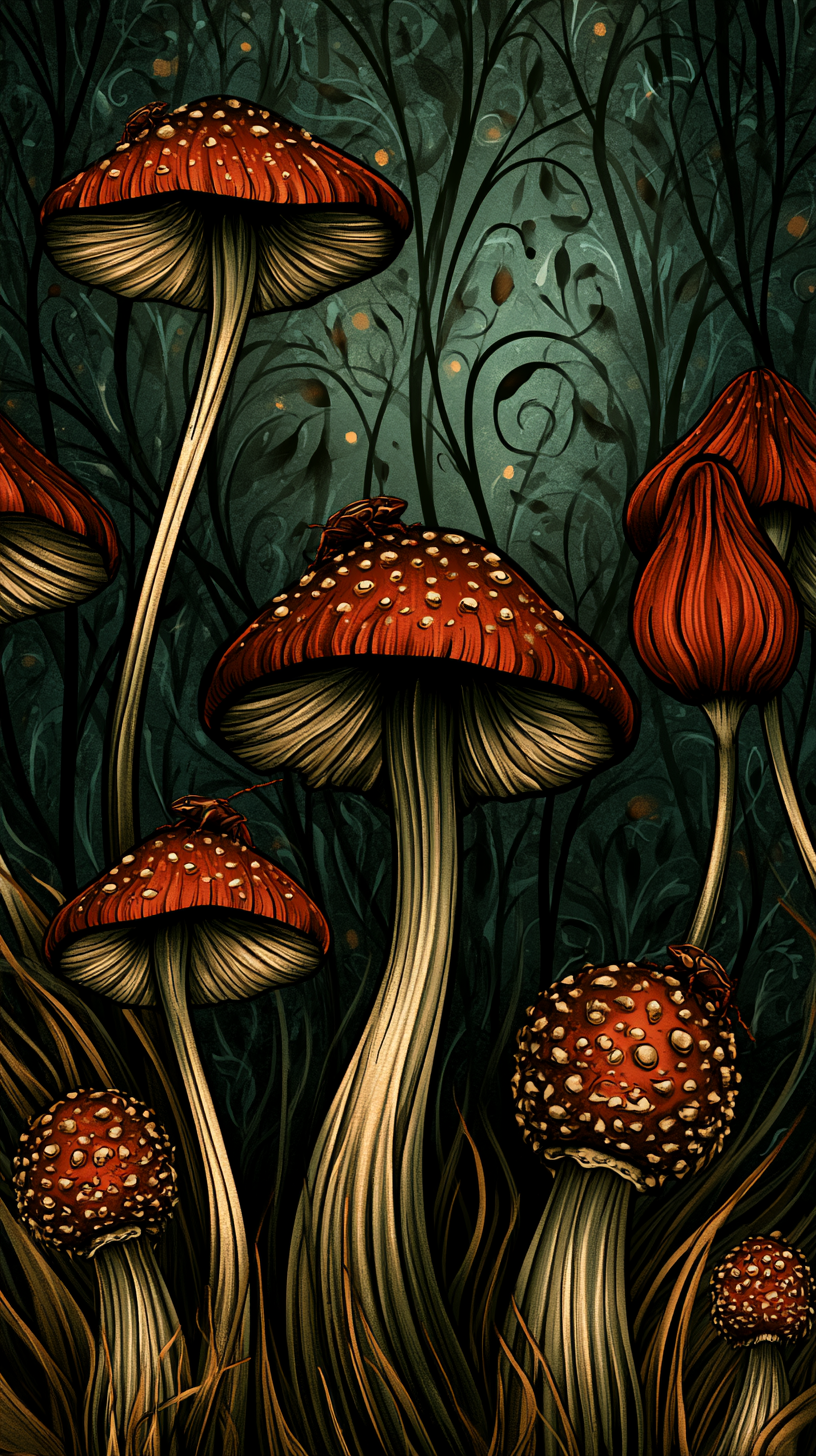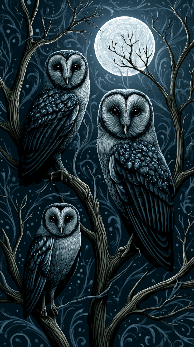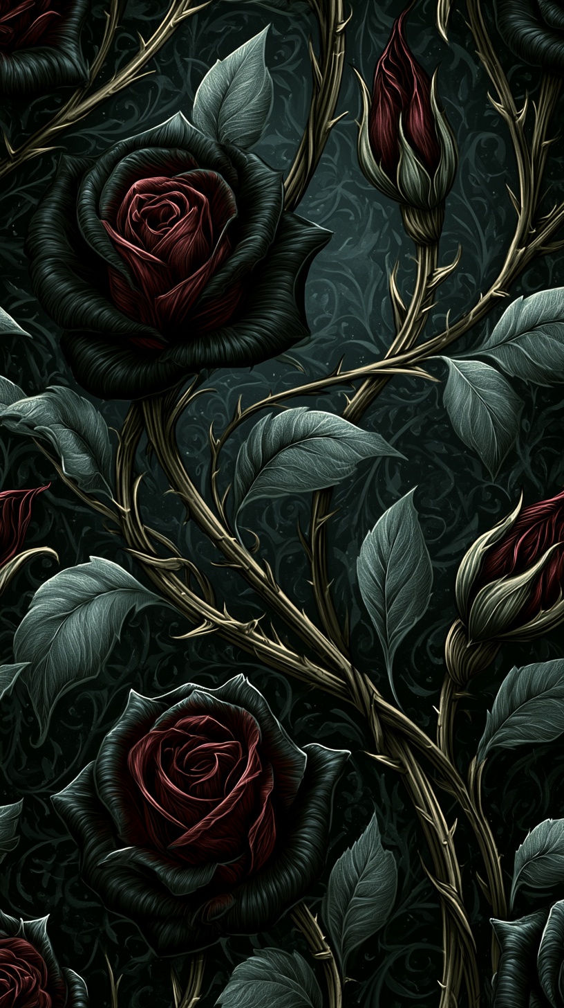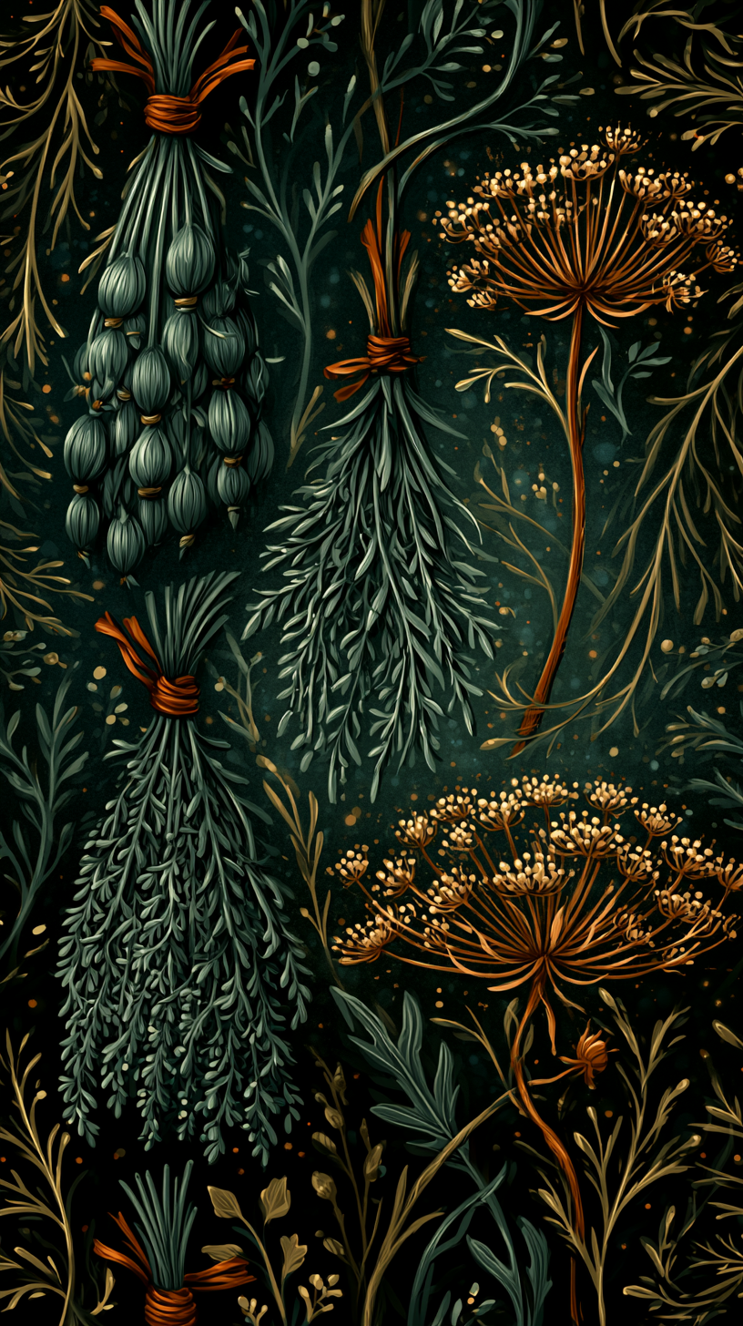
Wallpaper has a longer relationship with dark botanical imagery than most people realize. The Victorians filled their homes with densely patterned florals precisely because the natural world, to them, held as much menace as beauty.
Dark cottagecore wallpaper draws on that same instinct: pattern as a way of bringing the wilder, stranger parts of nature indoors, rather than just the parts that photograph well.
This short guide covers where the aesthetic comes from, the practical differences between wallpaper materials, how to choose a room and a palette, and how to style the finished result once it’s on your walls.
Inspiration gallery is at the end of the post.
RELATED: What is Dark Cottagecore?
Where the Aesthetic Comes From
Dark cottagecore wallpaper draws from three older traditions, not one:
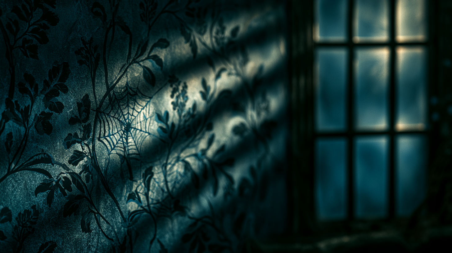
Victorian Pattern Design
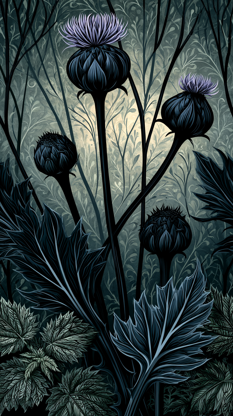
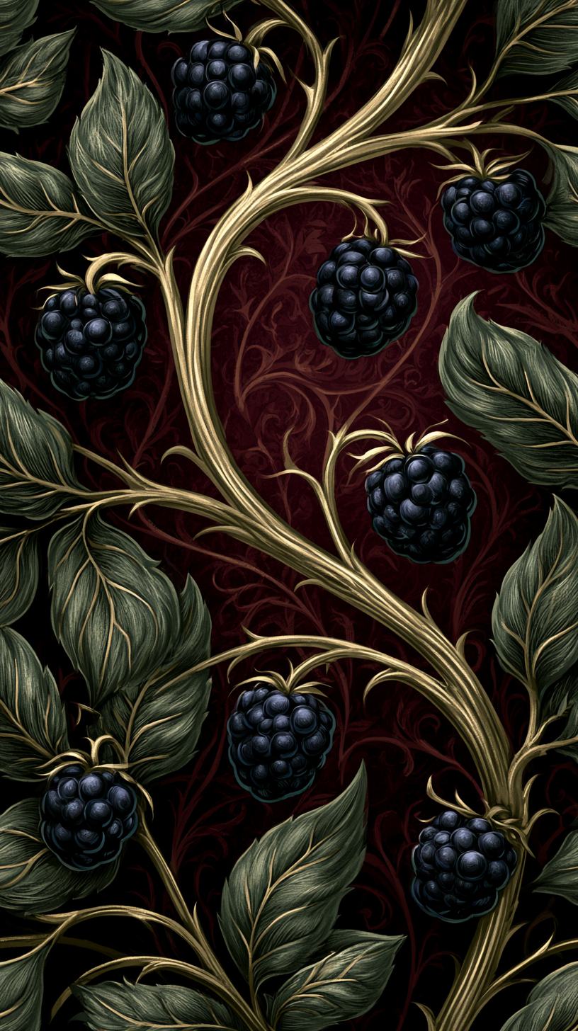
In the 1800s, dense, dark, botanical wallpaper was a mark of good taste, most famously through designer William Morris, whose tangled bramble and thistle patterns still show up in home decor today.
Morris designed with the belief that a pattern should never resolve into full symmetry at first glance, that the eye should have to work a little to trace where one repeat ends and the next begins.
That same restless, layered quality is a big part of what makes dark cottagecore pattern feel alive rather than static. Bold, busy wallpaper only started to feel old-fashioned once mid-century design pushed rooms toward plainer, lighter walls, a shift driven as much by changing manufacturing costs as by taste.
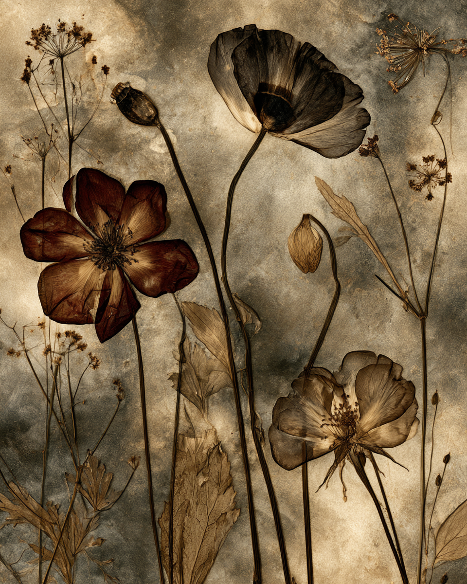
Botanical Illustration
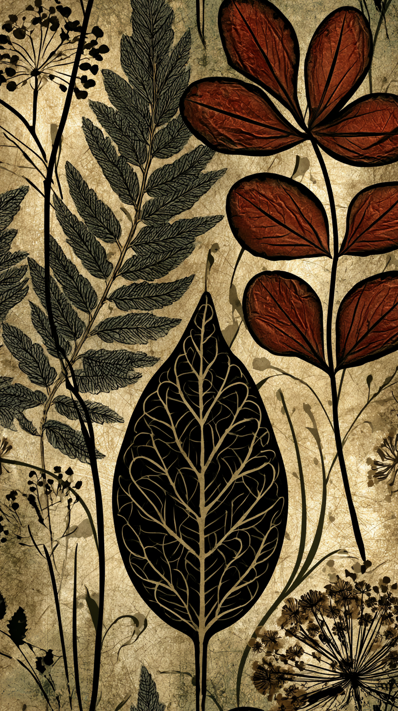
Long before this aesthetic existed, naturalists sketched and cataloged real plants with careful, precise linework, often for scientific study rather than decoration.
Herbarium collecting, the practice of pressing and archiving plant specimens, became genuinely widespread in the 17th and 18th centuries as part of a broader push to classify and understand the natural world.
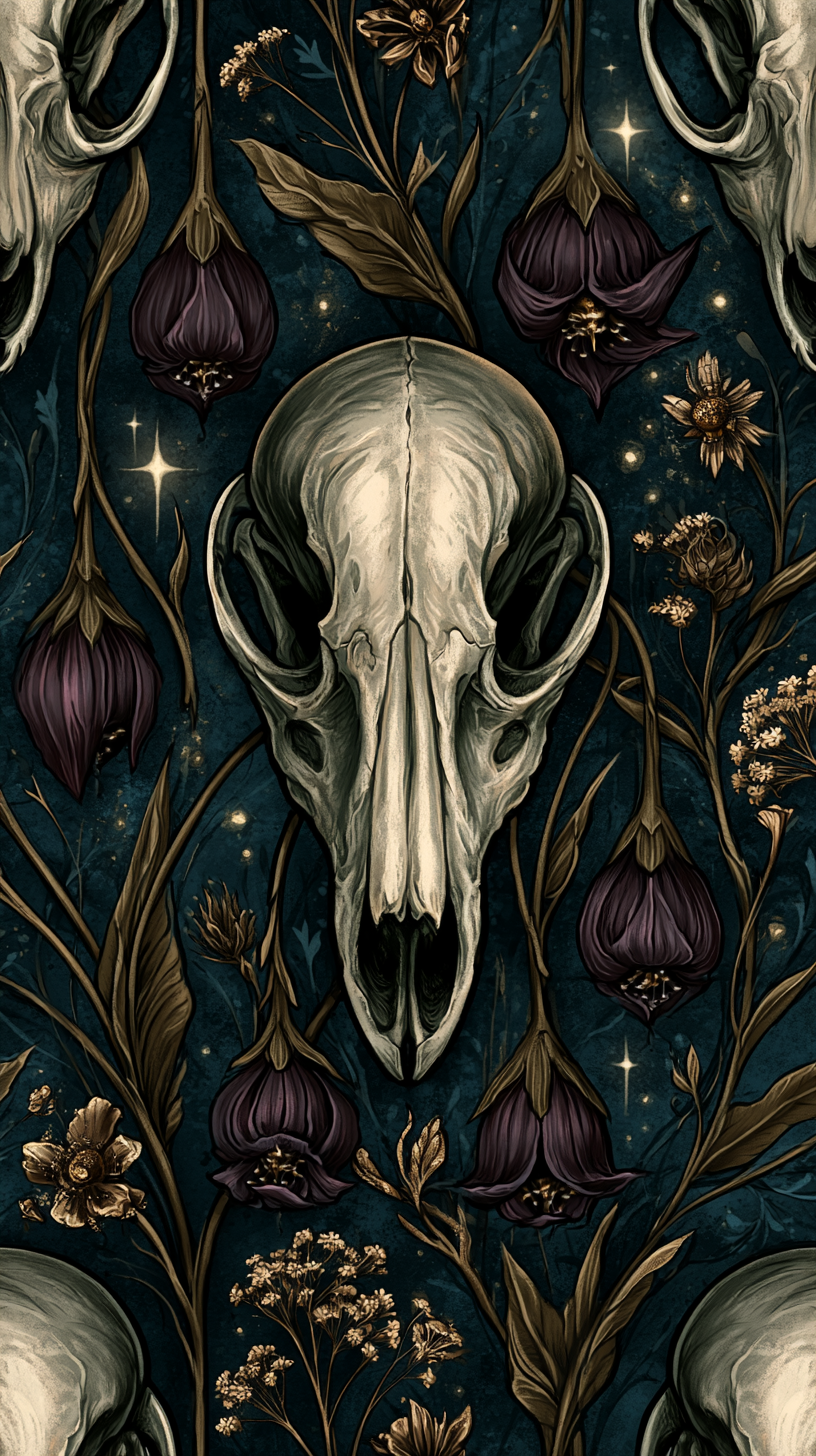
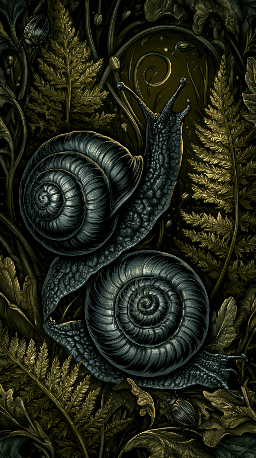
Dark cottagecore wallpaper borrows that same detailed, almost textbook style, even when the plant itself is fictional or arranged in a way that would never grow in an actual garden. The precision is part of the appeal: it signals that the wildness on the wall is being observed carefully, not just imagined.
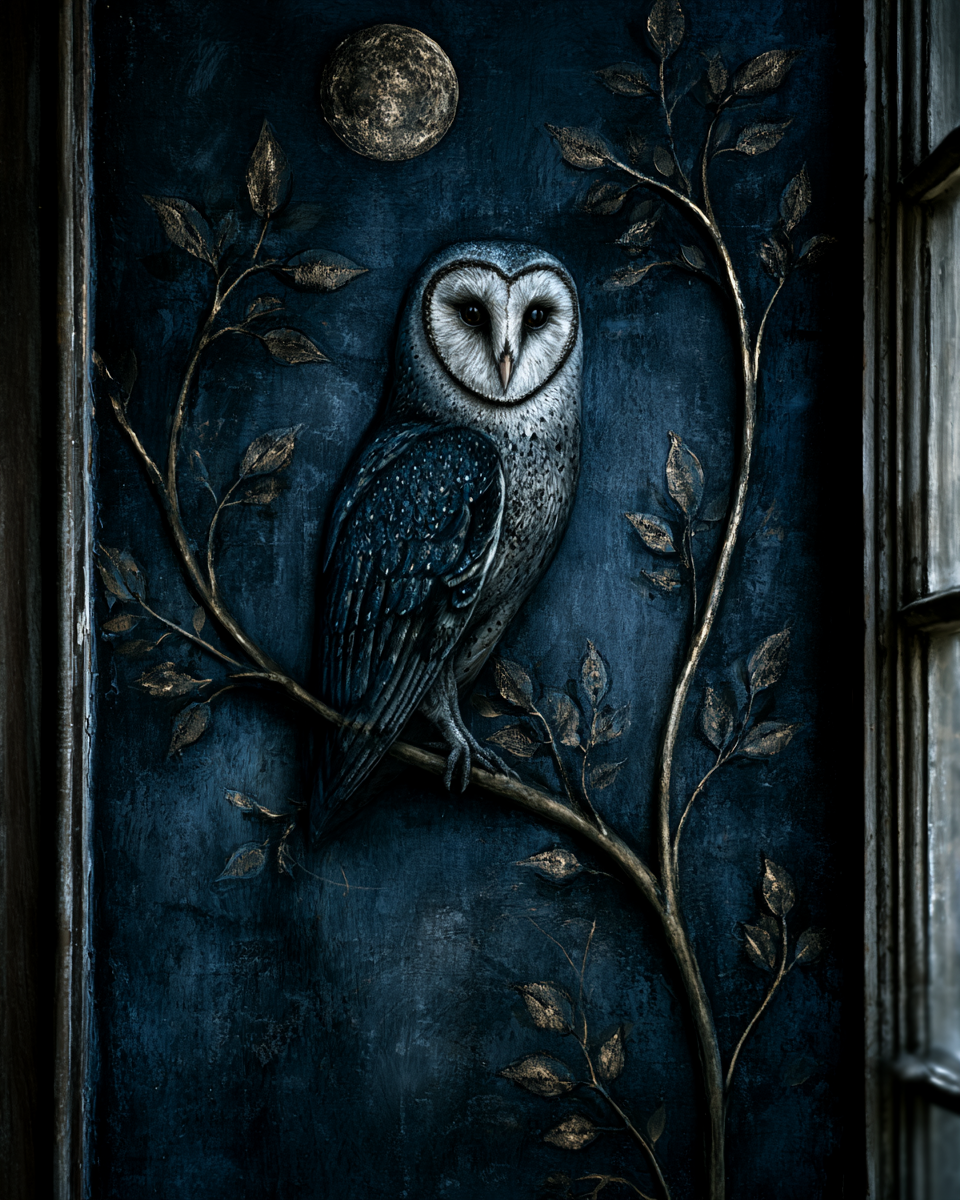
Folklore
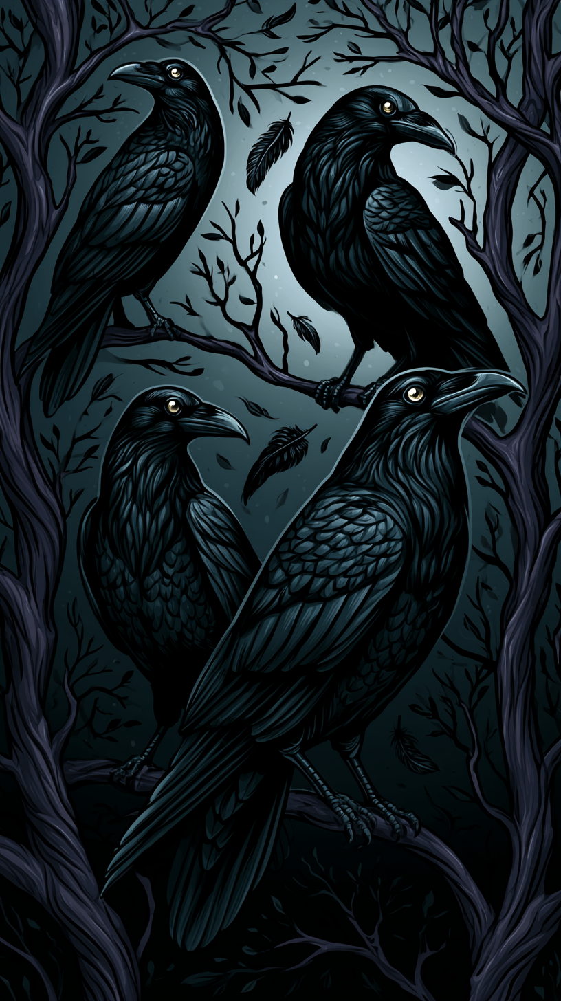
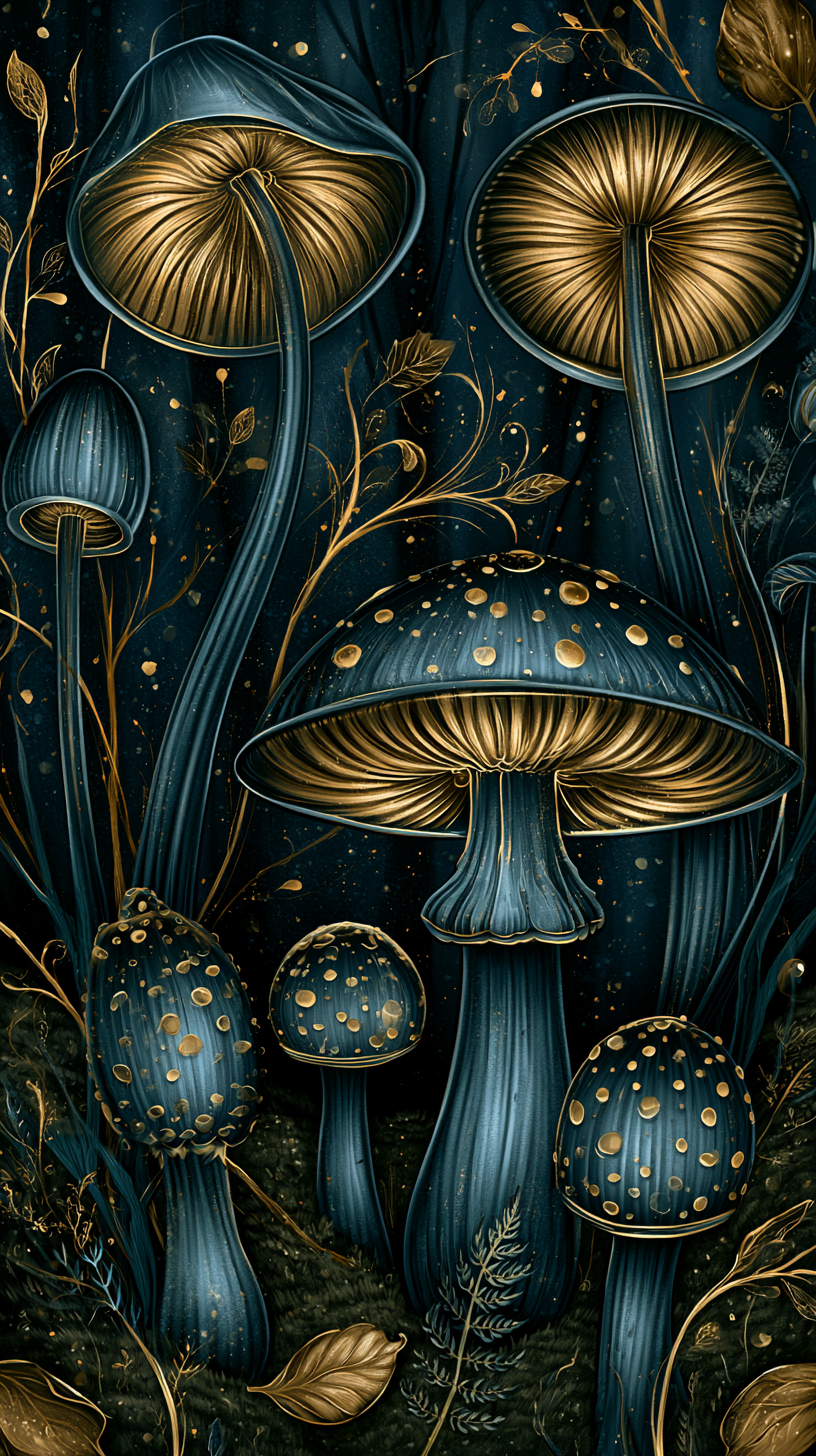
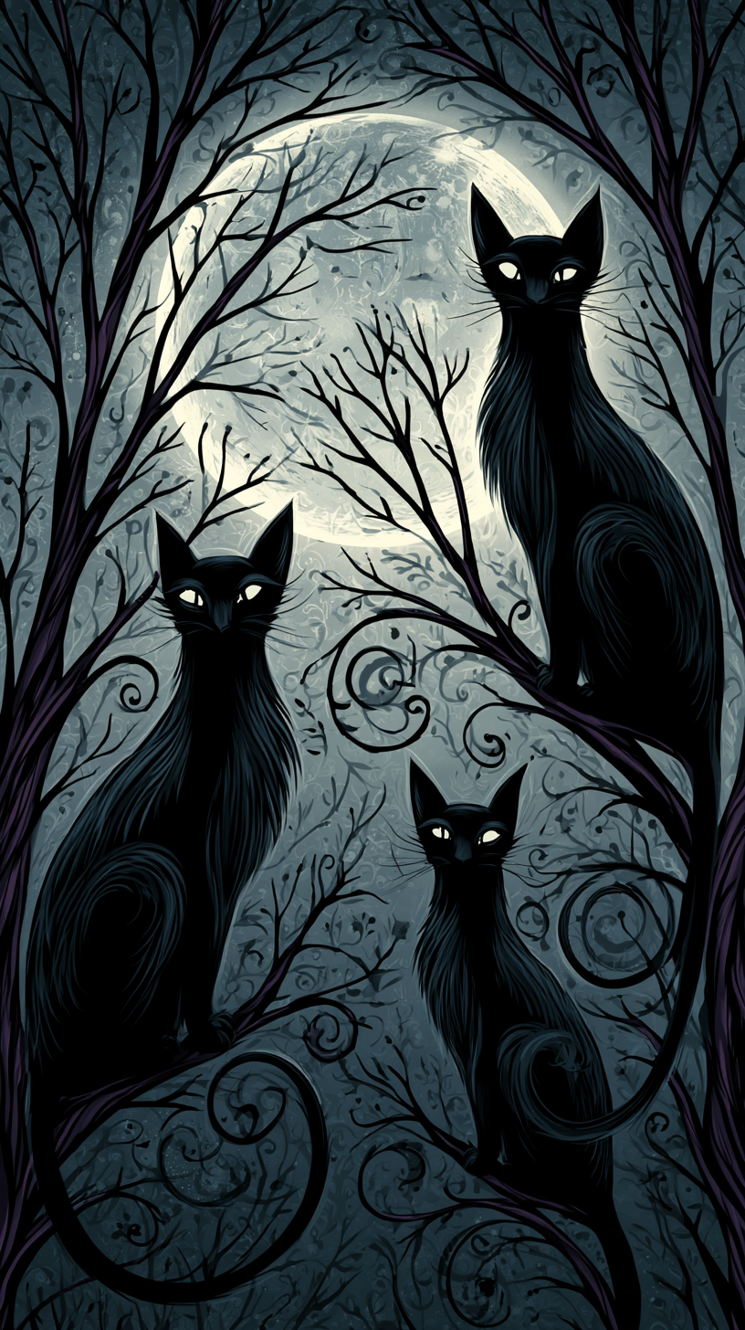
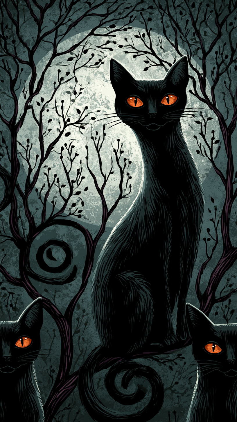
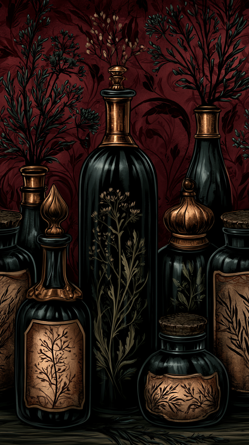
Owls, ravens, black cats, spiders, and mushrooms all carry old stories and superstitions attached to them, some genuinely centuries old, some more recent inventions from film and illustration.
A raven calling near a house, a black cat crossing a path, a ring of mushrooms appearing overnight after rain: these all had specific meanings to people who lived closer to unpredictable, unexplained natural events than most of us do now.
The strongest dark cottagecore designs lean on that older, specific folklore rather than generic “spooky” imagery, which is part of what sets them apart from a Halloween print built for a single season.
Types of Dark Cottagecore Wallpaper to Know
Choosing a wallpaper style is as much a practical decision as an aesthetic one, and the material affects both how the finished room looks and how much effort goes into getting it there.
Traditional Pasted Wallpaper
Sometimes called non-woven or vinyl wallpaper depending on the backing material, this is the most durable option and the best choice if you’re committing to a room long term.
It holds up well to humidity when the right material is chosen for a bathroom or kitchen, and it tends to have the richest, most saturated color reproduction of the three options here, which matters for a lot of the deep navy and near-black palettes common in this aesthetic.
The tradeoff is installation: pasted wallpaper generally requires either a professional installer or a fair amount of patience, since seams need to be aligned carefully and air bubbles worked out before the paste sets.
Peel-and-Stick Removable Wallpaper
This style has improved significantly in quality over the last several years and is the better choice for renters or anyone who wants to change a room’s mood seasonally.
Most people can apply it themselves in an afternoon, and it comes off cleanly enough to reuse in some cases, though color saturation and pattern repeat quality vary more between brands than with traditional paper, so it’s worth ordering a sample swatch before committing to a full room.
Custom Print-on-Demand Wallpaper
Through services like Spoonflower, this option lets you upload or commission a specific pattern and have it printed to your wall’s exact dimensions.
It’s the most flexible choice if none of the ready-made patterns you find are quite right, and it’s often the only realistic path if you want something built around a very specific motif, like a particular plant or a color story that doesn’t exist in a commercial line.
It tends to be the most expensive option per square foot, and turnaround time is longer since nothing is pre-manufactured.
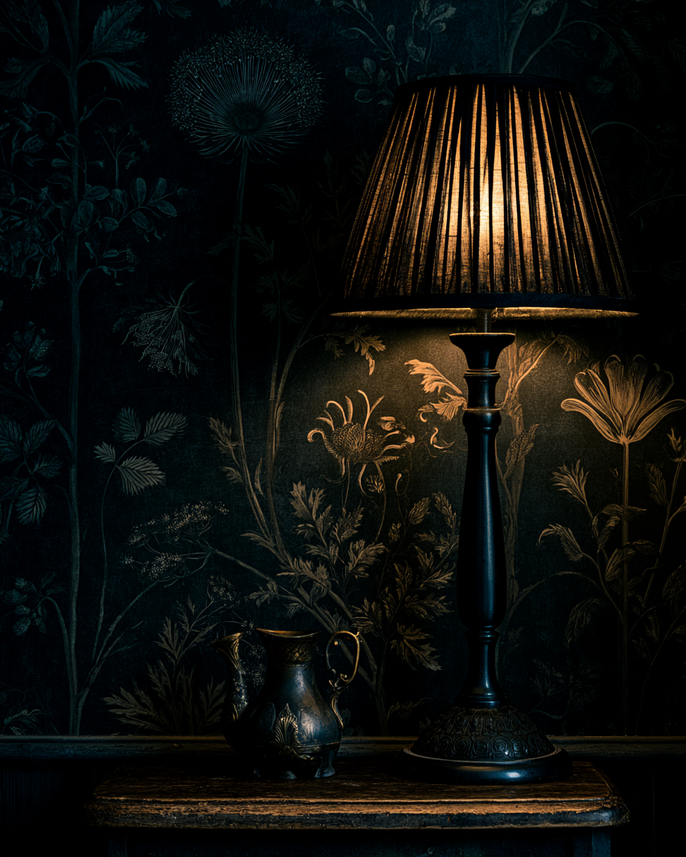
Choosing a Room for Dark Cottagecore Wallpaper
Dark, saturated wallpaper reads very differently depending on the light in a room, and this is one of the most common places people run into trouble after committing to a pattern.
North-facing rooms and spaces with limited natural light can feel closed in by the darkest palettes (near black, deep navy) applied to all four walls, since there’s little bright surface left to bounce light around.
The same pattern on a single accent wall, or in a room that gets strong afternoon light, tends to feel intentional and rich rather than heavy.
It helps to actually observe a room across a full day before deciding, since a space that looks fine at midday can feel very different by evening under artificial light alone.
Warm bulbs (soft white, around 2700K) tend to flatter the burgundy and rust palettes in this aesthetic, while cooler bulbs can wash out the warmth in those same colors and make navy and charcoal palettes feel more true to their daytime appearance.
Smaller rooms, powder baths, closets, the inside of a pantry or cabinet, are often the best place to start if you’re unsure about commitment.
A bold, dark pattern in a small enclosed space reads as a deliberate design choice, while the same pattern across an entire open living area can overwhelm a space that also needs to function for everyday life, work, cooking, gathering, and everything in between.
Working with Color
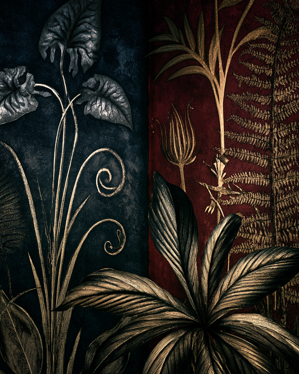
Dark cottagecore wallpaper tends to fall into a few recognizable palettes, and each behaves differently in a room depending on lighting, furniture, and what’s already on your walls.
Deep navy and indigo read as cool and nocturnal, and work best with some natural light to balance them, or as an accent wall rather than a full room. They pair well with brass or gold hardware, which reads as warm against the cool background rather than getting lost in it, and with pale furniture (cream, bone, weathered wood) that keeps the room from feeling entirely dark.
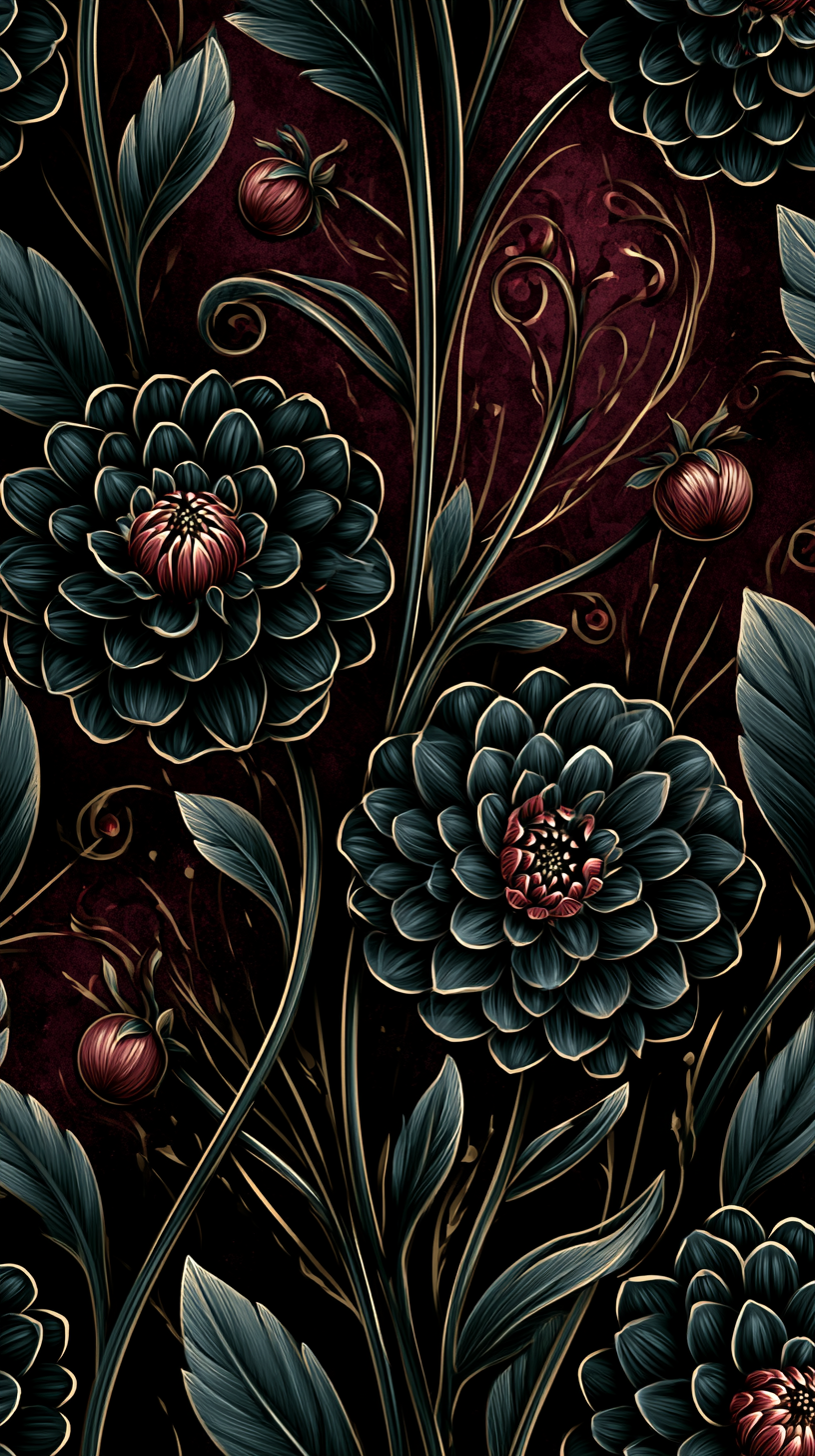
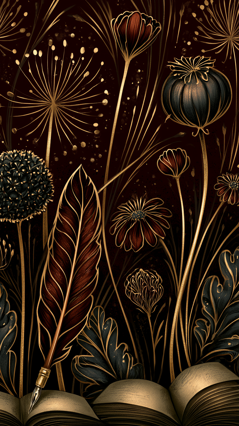
Burgundy and rust read warmer and pair naturally with wood tones, brass hardware, and warm lighting. These palettes tend to be the most forgiving of mismatched trim or older woodwork, since the warmth in the wallpaper tends to harmonize with whatever warm undertones already exist in aged wood.
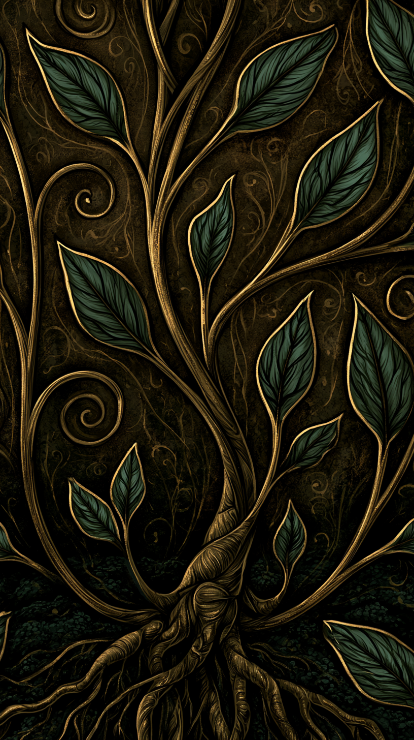
Forest green and gold sit in between the two, and tend to be the most forgiving choice in rooms with limited natural light, since they read as rich rather than heavy. They also tend to pair well with plants and greenery in the room itself, since the wallpaper doesn’t compete visually with living botanicals the way a very dark or very saturated pattern sometimes does.
For more on building out a full room around one of these palettes, see our dark cottagecore color palette guide.
Styling a Room with Dark Cottagecore Wallpaper
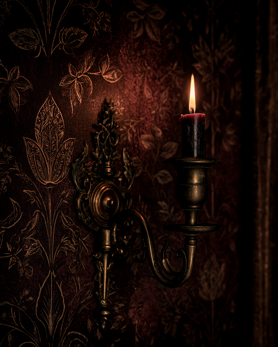
Once the wallpaper itself is up, a few small choices tend to make the biggest difference in how finished the room feels. Frame choices matter more than people expect: dark, ornate frames (aged brass, dark wood, or black metal) tend to disappear into a busy pattern in a good way, letting whatever is framed read as the focus, while pale or modern frames can feel visually at odds with a richly patterned wall.
Lighting fixtures are worth choosing deliberately rather than defaulting to whatever came with the room. Wall sconces with warm bulbs cast the kind of low, directional light that flatters a dark pattern far more than a single bright overhead fixture, which tends to flatten pattern and color from directly above.
Textiles, curtains, throw pillows, a bedspread, are a lower-commitment way to test a color direction before wallpapering. If you’re unsure whether a burgundy or a forest green palette suits a room, living with the color in a smaller textile first for a few weeks can tell you more than a paint chip or a wallpaper sample ever will.
Where to Find Dark Cottagecore Wallpaper
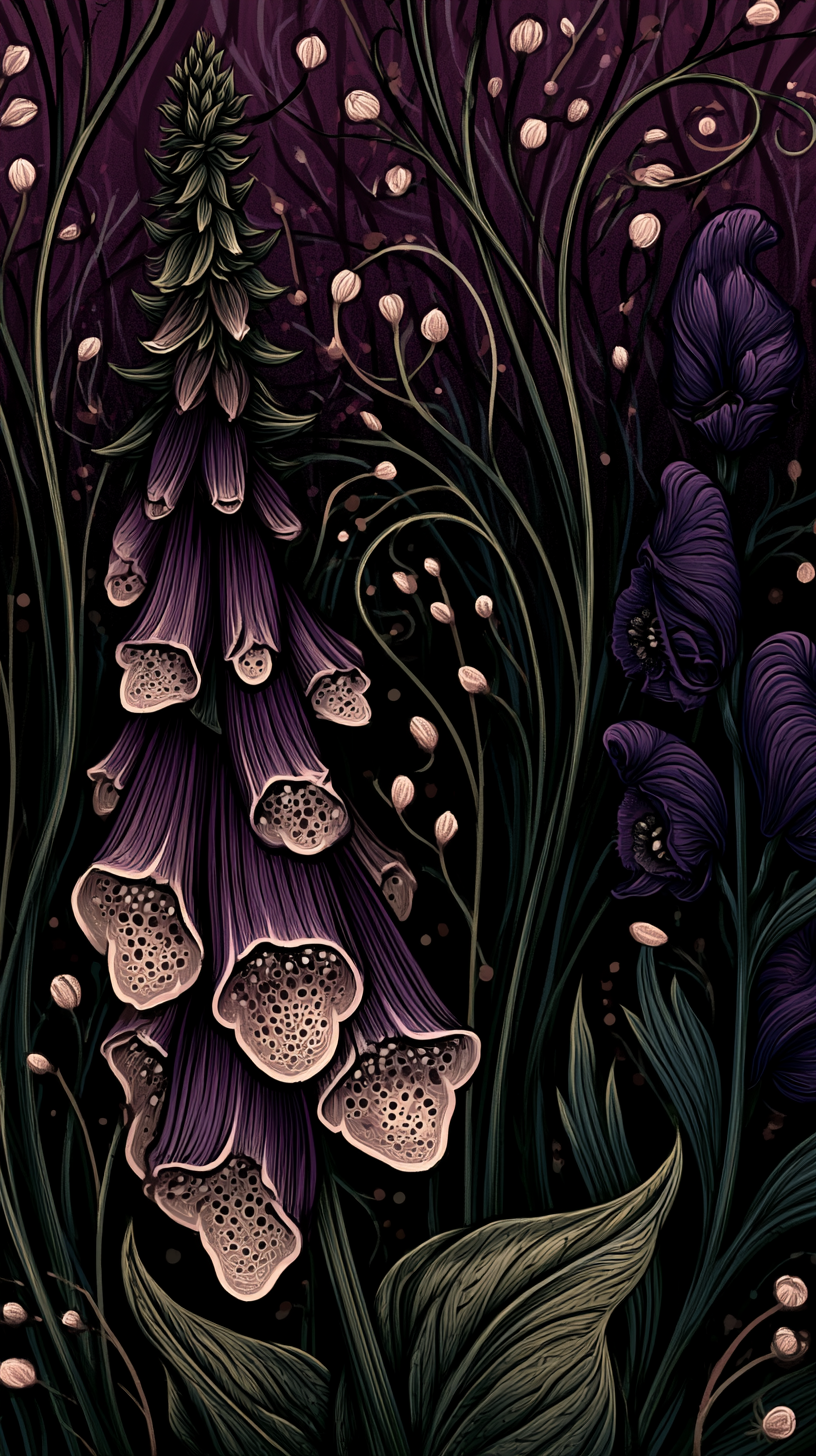
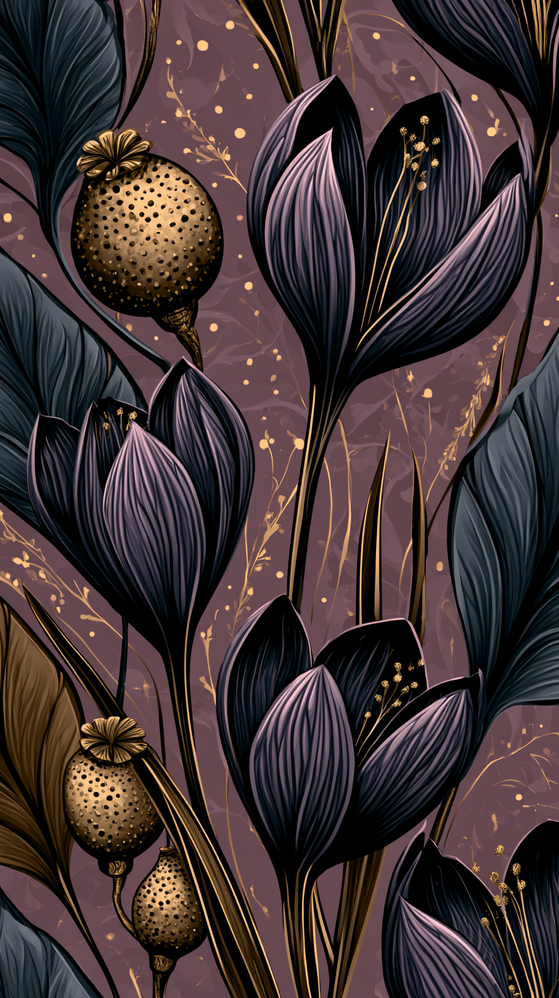
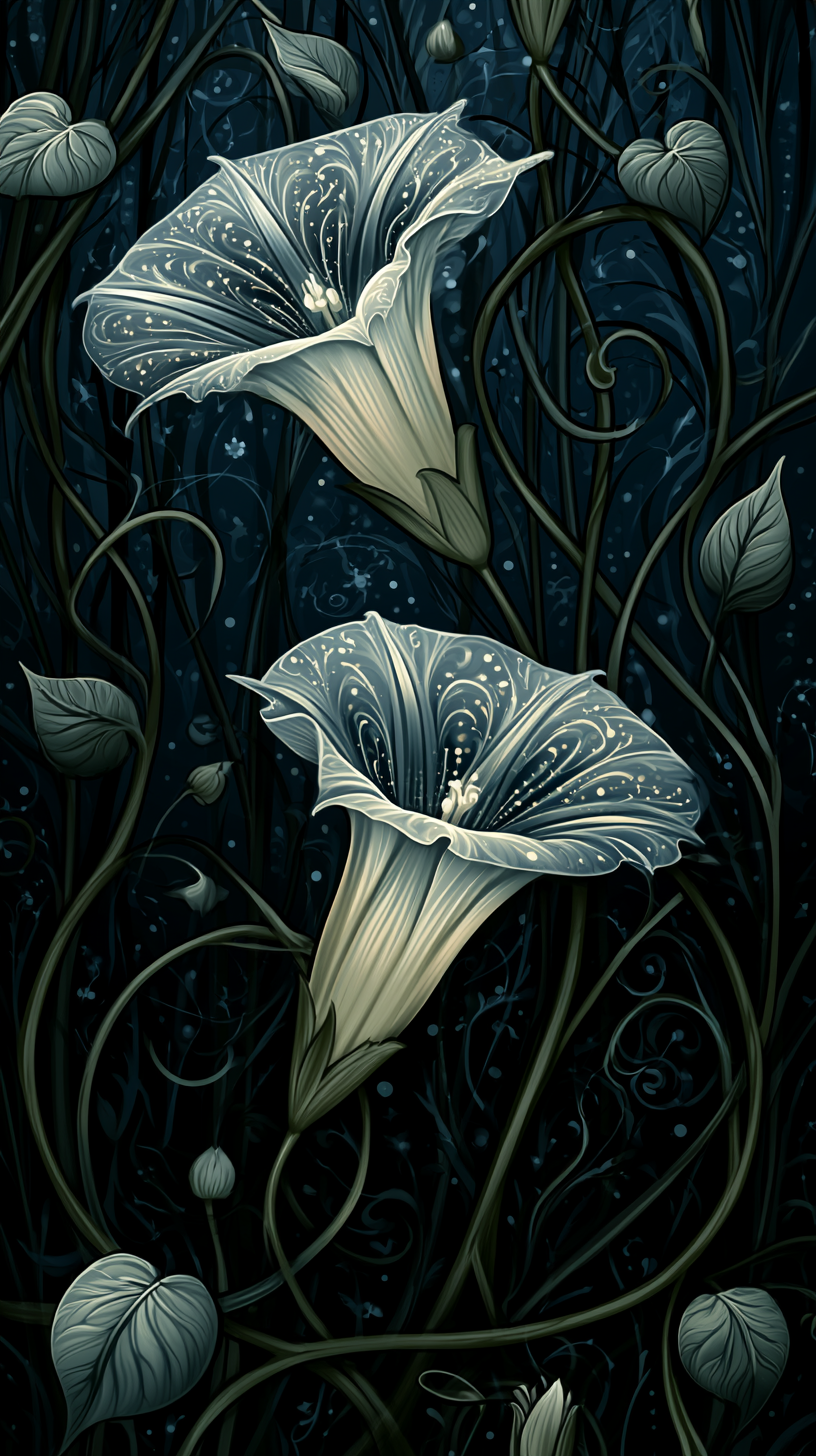
None of the patterns pictured below are available to purchase directly from us.
If one catches your eye: search Etsy for independent sellers working in gothic or witchy botanical styles, many of whom will customize an existing pattern; try Spoonflower for a fully custom commission; or look at established gothic maximalist wallpaper houses like House of Hackney or Timorous Beasties, which work in a similar register at a higher price point.
Whichever route you take, ordering a physical sample before committing to a full order is worth the small extra cost and wait, since screen colors rarely match printed colors exactly, particularly in the deep, saturated tones common to this aesthetic.
Dark Cottagecore Wallpaper Ideas
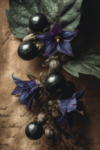
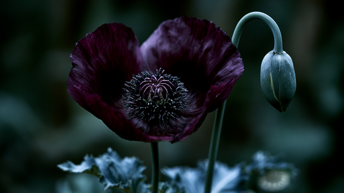
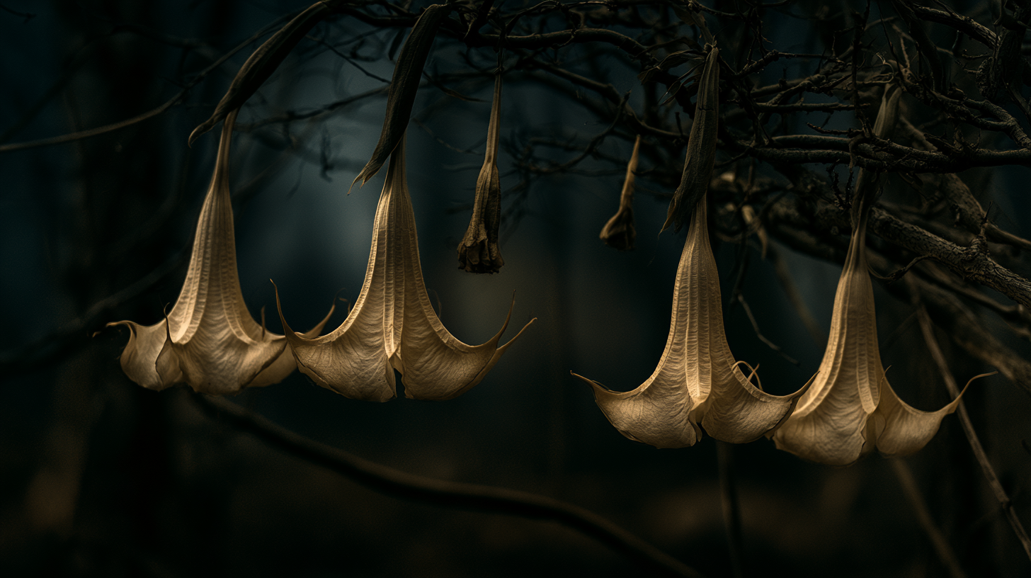
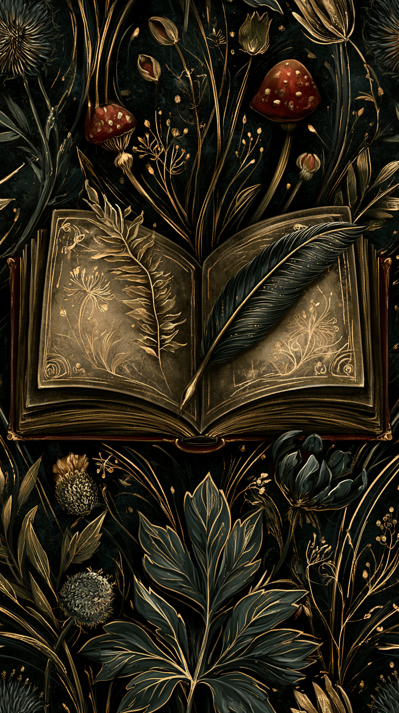
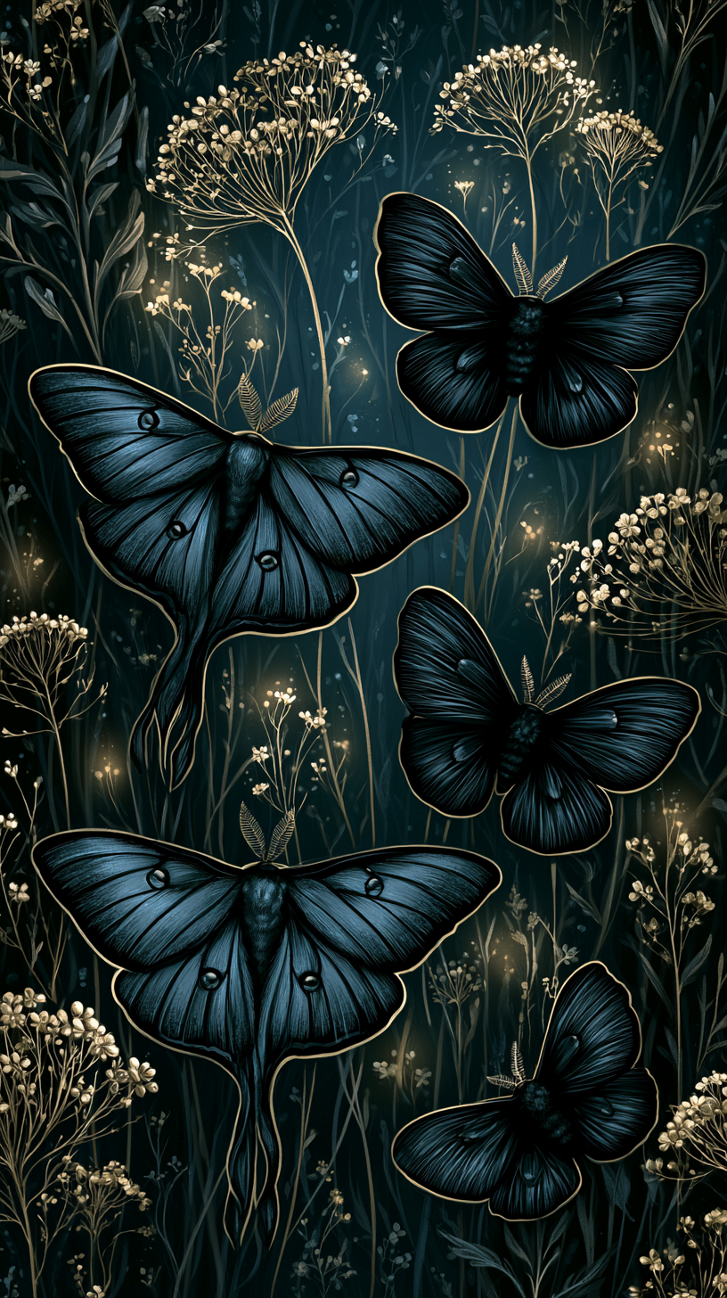
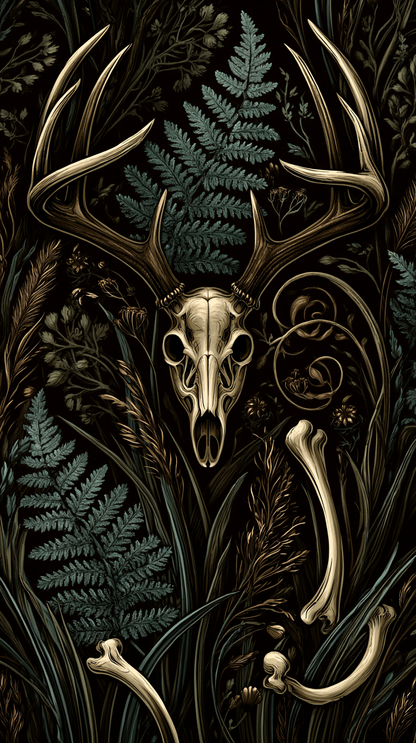
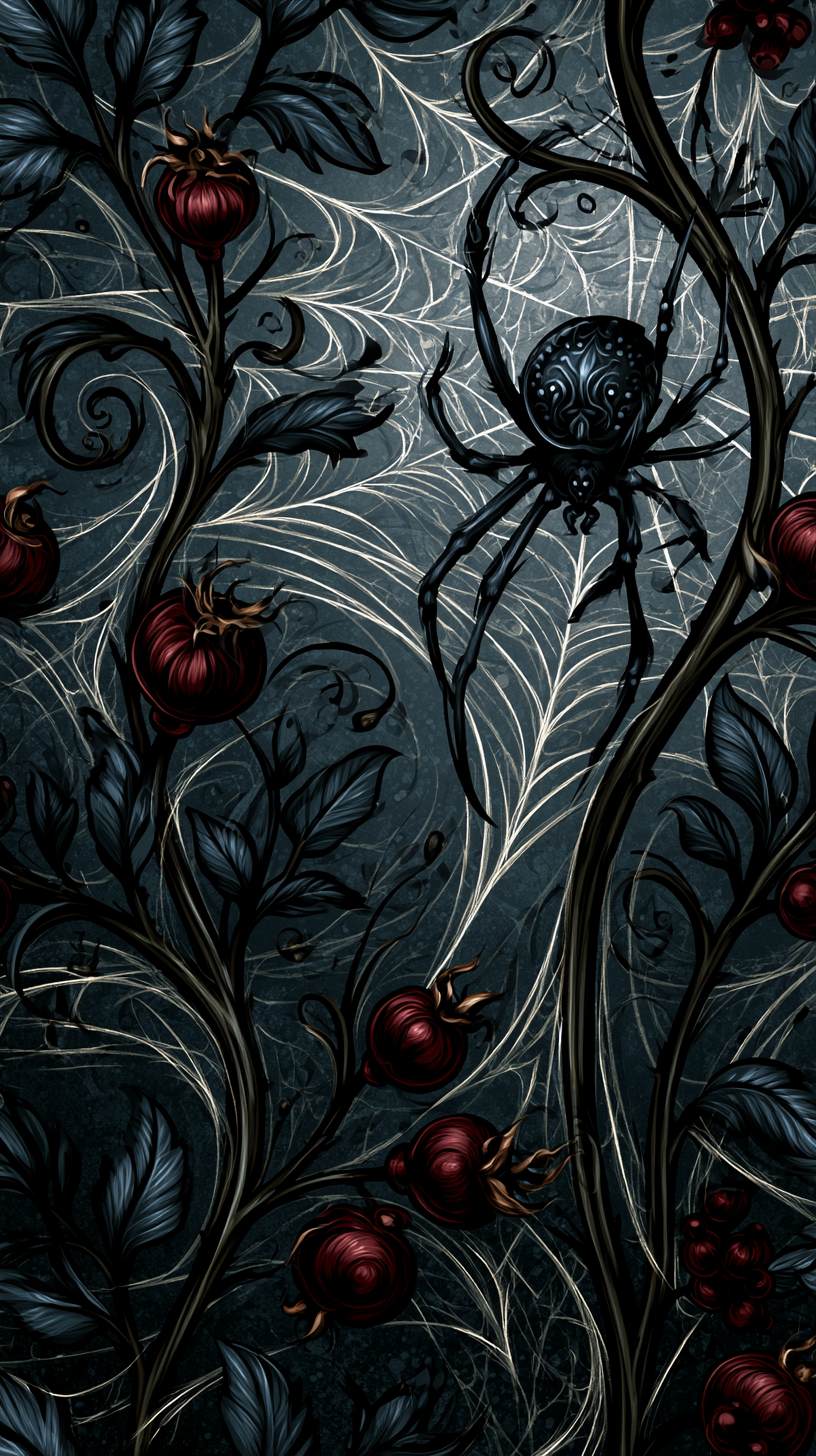
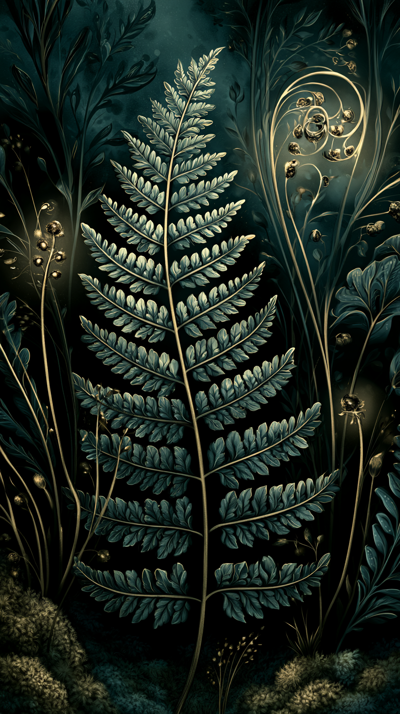
The gallery below is a set of visual references, not products for sale.
Use it for inspiration when you’re browsing shops, describing what you want to a wallpaper designer, or searching stock libraries for something close to your own taste.